Roles: UI/UX designer, UX researcher
Skills: UI/UX Design, UX Research, Child-friendly Design
Overview
A project under the UCLA Human-Computer Interaction lab, StoryFairy uses generative AI to create parent-child storytelling experiences. Users would select characters, scenes, and new entities to add to the story, and AI would generate art and text to create a child-friendly experience for the users. It is intended to be an interactive experience between a parent and a child.
Roles
I was the UI/UX designer and UX researcher for the project.
Problem
The initial story creation UI was very cluttered and the wide range of choices caused analysis paralysis. It was not child-friendly, as children were not interested in the dense layout of the pages, and children who could not read cannot engage with the selection part of the app without a lot of parental guidance.
The storybook portion of the app was also very visually busy and not child-friendly: children were disinterested in the app and parents were confused about the significance of each part of the UI.
Process
To make this app truly a parent and child storytelling experience, I outlined a few goals for myself:
Present the information in a familiar and digestible way
Create a child-friendly interface
Overall clarity in interactions and visuals
Iteration 1 - Images
The goal of this iteration was to:
Add in images for children to engage with
Reduce the clutter in the UI
The layout of the options was somewhat inspired by Coolors.co's color generator, with the refresh icon intending to be the "regenerate" icon and the arrows for going back and forth between options. This was not a common pattern and thus confusing for users.

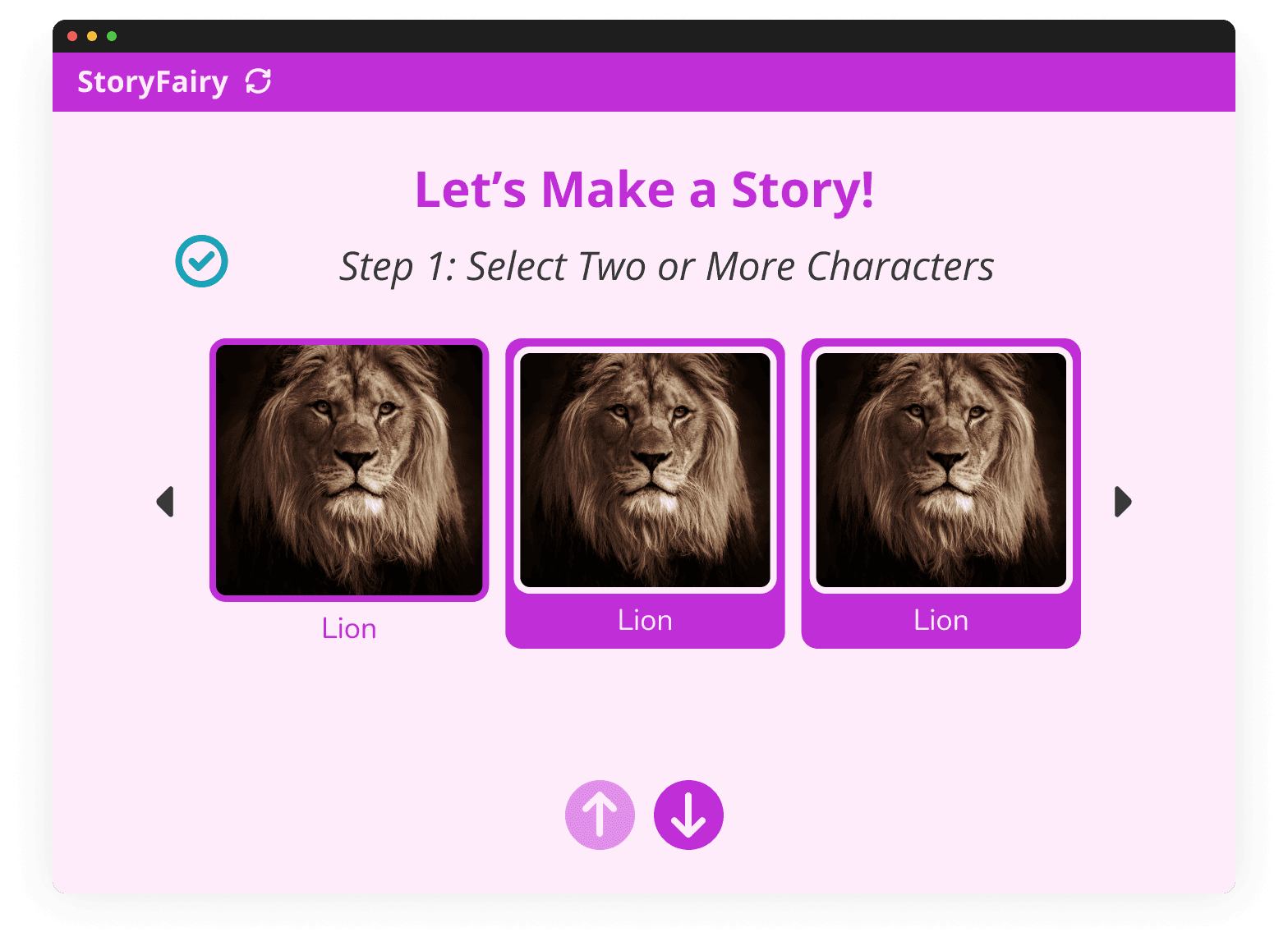
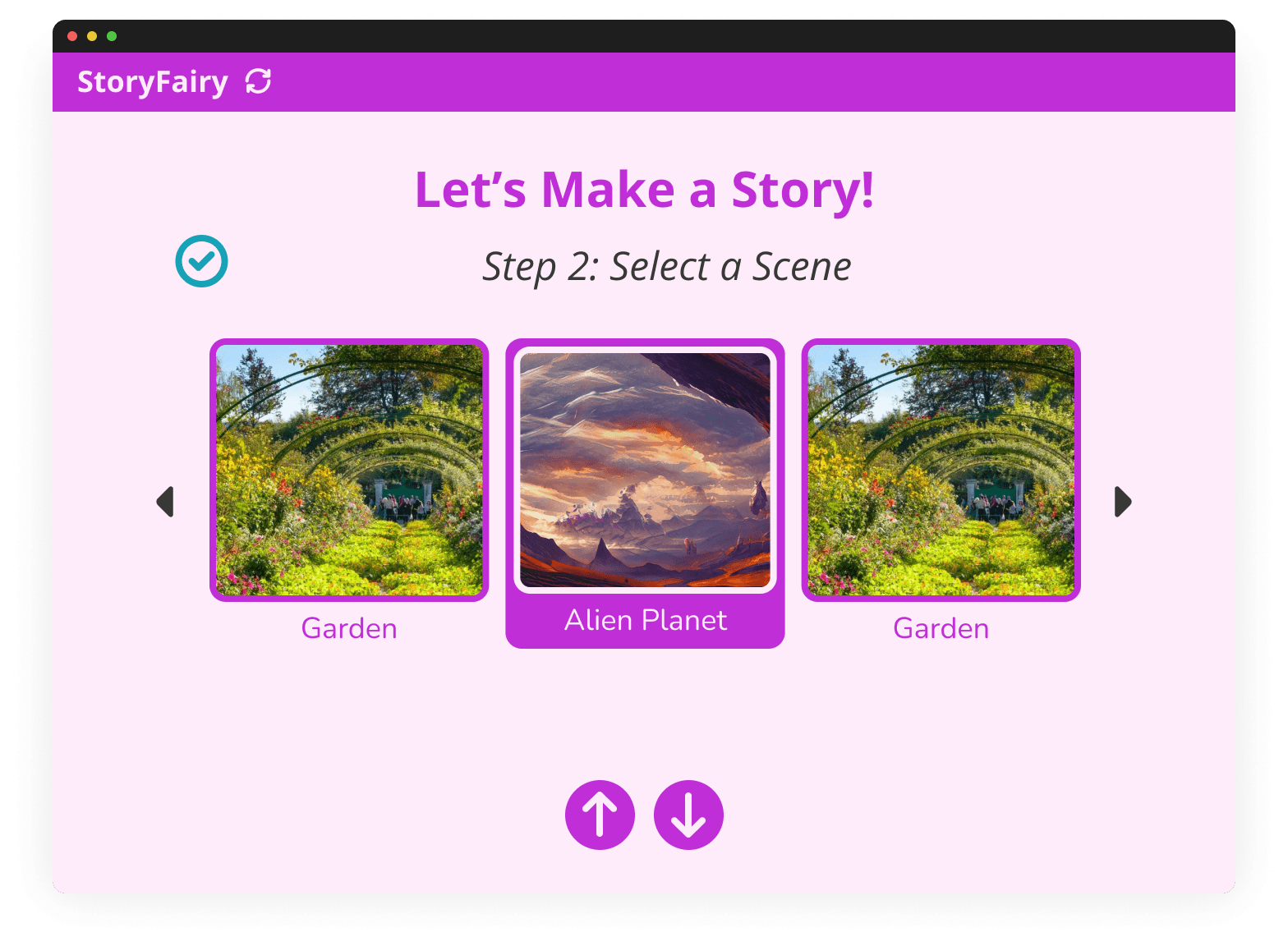
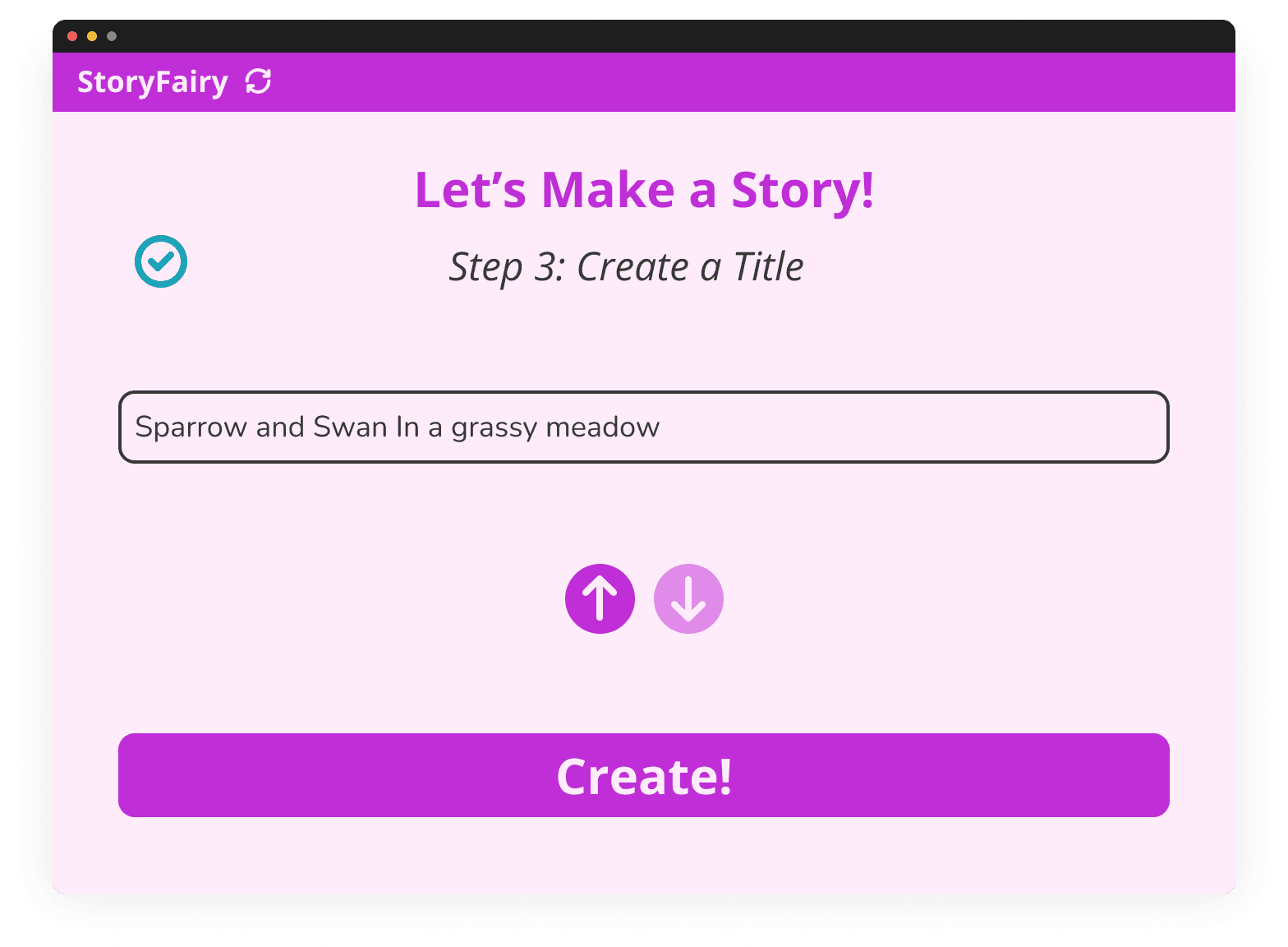
Iteration 2 - Steps
The goal of this iteration was to further declutter the screen:
Split story creation into a 3-step process: character selection, scene selection, and title creation
Character and scene options are now organized into a horizontal infinite scroll
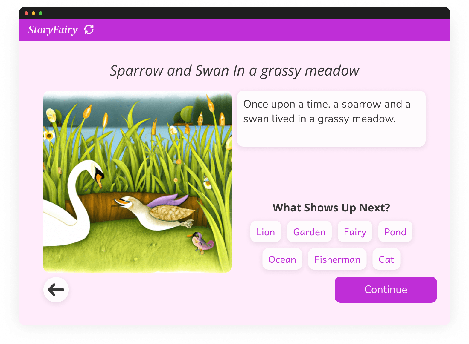
Redesign of the storybook portion, emphasizing the readable text
Rephrase the prompt to "What shows up next?"
The arrows at the bottom of the screen were confusing for navigation.
Iteration 3 - User Testing
The goal of this iteration was to address the issues of iteration 2:
Fixed bottom navigation by making it consistent across the app
Made the overall style more child-friendly
Step 3 in story creation was removed as it did not add to the experience much
User testing was conducted on this iteration. Overall, users were able to understand the app, but some issues were noted:
Character selection screen was cumbersome to navigate
Many thought "what shows up next?" was required for the story to proceed
Black-and-white icons for characters were unengaging and unclear
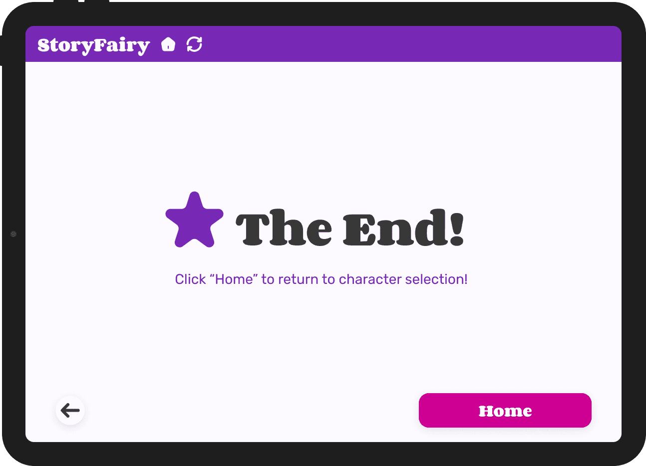
The lack of a "The End" screen caught people off guard

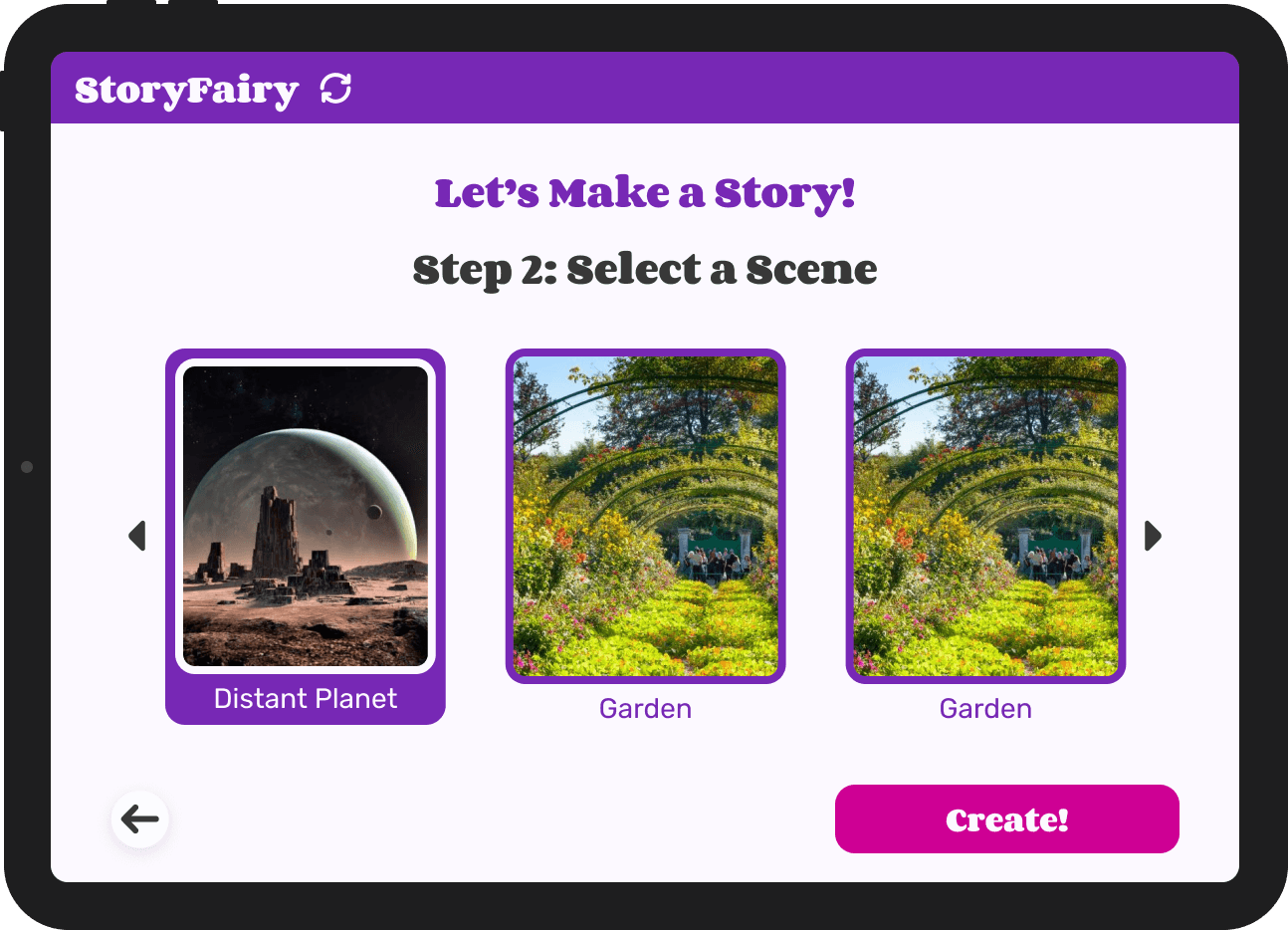


Solution
Here are the final wireframes for StoryFairy with improvements based on Iteration 3.
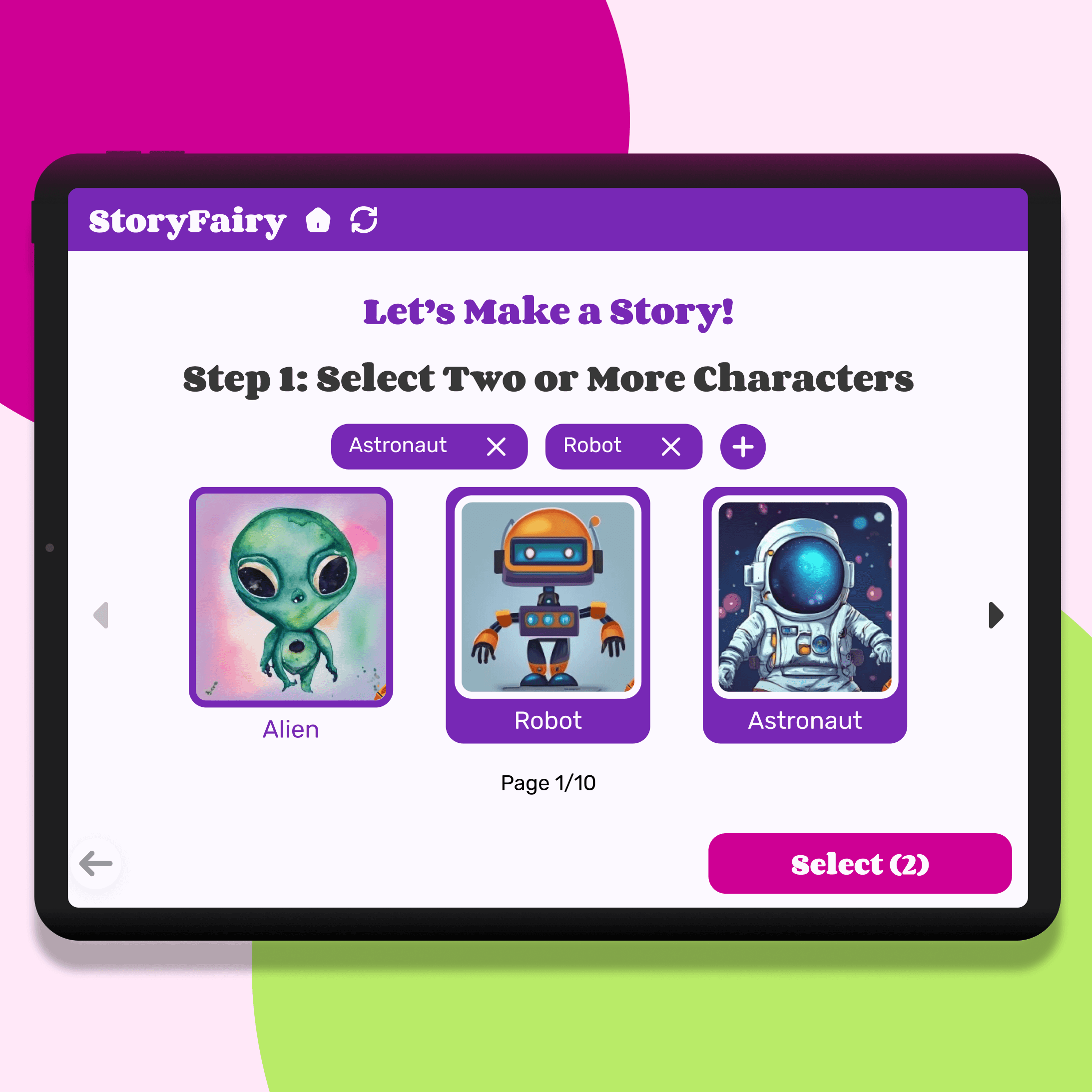
Character + Scene Selection
The common issues in iteration 3 were addressed:
Streamlined Character / Scene Selection
Options are on different pages
Keep tabs of all of the characters selected
Avoid scrolling through many characters in order to deselect
Plus sign allows users to add their own characters or search for existing characters
Colored images instead of black-and-white icons for more clarity

Storybook
The common issues in iteration 3 were addressed:
"What shows up next?" is now "Add New Story Elements" with a dropdown for the new elements to indicate that the step is optional
The End screen before redirecting users
Contains instructions on what "Home" does