Roles: Design Co-lead, UI/UX Designer
Skills: UI/UX Design, UX Research, Project Management
Overview
UCLA is a research university, yet there lacks an up-to-date and centralized system for undergraduate students to discover research opportunities. bResearch will be a regularly updated platform that connects students to researchers' lab positions.
Roles
This was a project created with my team at DevX at UCLA. I was the design co-lead and a UI/UX designer for this project, responsible for UI/UX design, UX research, communicating with other teams, and managing the rest of the design team.
Process
We began by analyzing the existing undergraduate research portal, noticing its strengths and weaknesses.
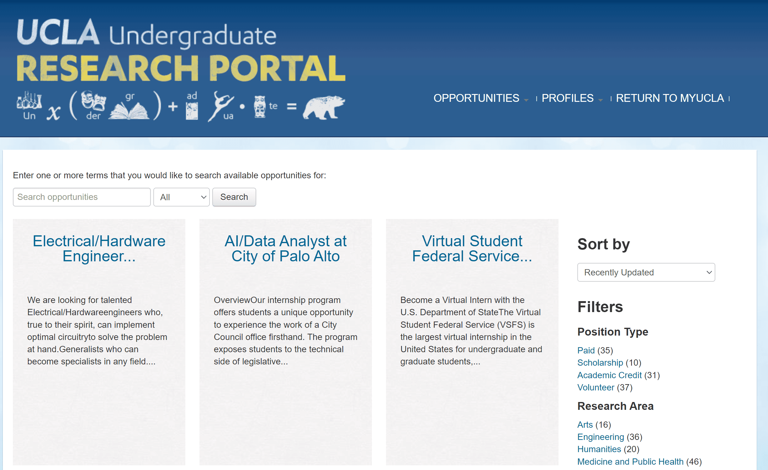
Strengths
Includes a wide variety of opportunities (from research to jobs)
Good filter types
Easy to navigate between positions
Weaknesses
Holds many out-of-date positions
Very difficult to tell at-a-glance what the positions are
The posting descriptions are difficult to read
The filtering system is not very intuitive
Hard to return to the overall page
Users
We then proceeded to identify the users who may benefit from our platform. We identified two big groups:
Researchers (including PIs and graduate students)
Undergraduate students.
We conducted user interviews with graduate student researchers and gathered survey data from both professors and students, and found that over 80% of the professors and 100% of the students surveyed were interested in an application that creates a more centralized and consistent research position application process.
Researchers want
Diversity and equity in student pool
Hosting files for applications
Ability to update positions (unlike email listservs)
Students want
Comprehensive, regularly updated list of open positions
A list that is easy to browse and understand

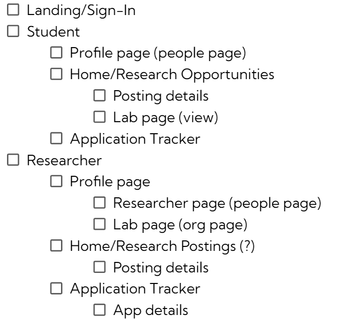
Design Process
We generated user flows and requirement lists for the website, then designed iterations of lo-fi and hi-fi wireframes of bResearch based on these requirements. At the same time, we also determined a minimalist and navy blue and light blue color palette as our visual identity.
Requirement List
Researcher User Journey
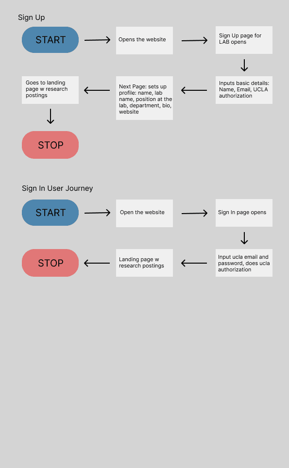
Student User Journey
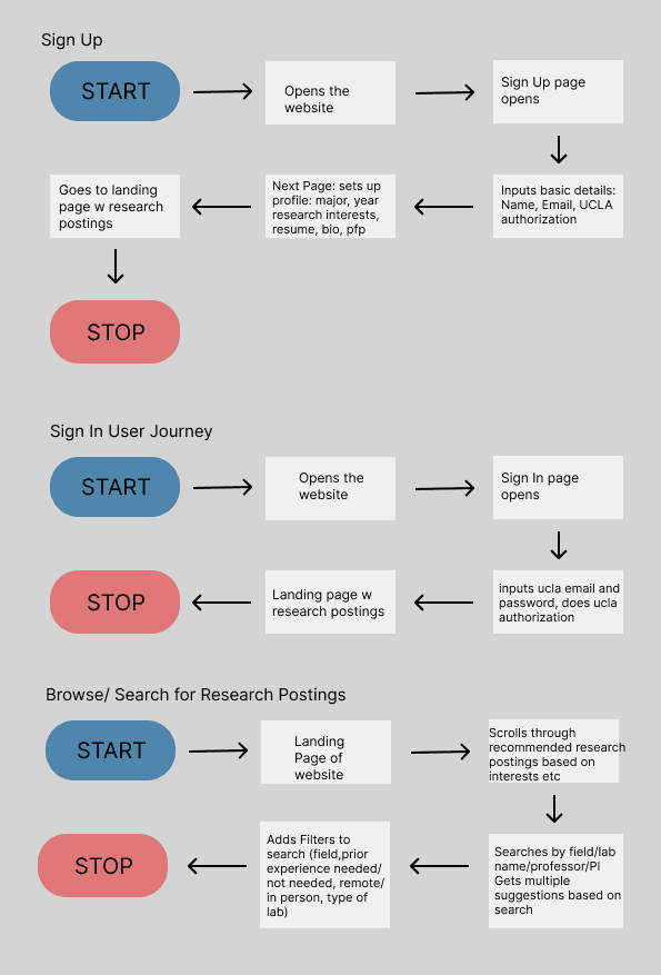
We communicated with programmers and marketing throughout the process to update our designs and make sure they are achievable. Overall, we wanted to keep the design simple, familiar, and easy to navigate (referencing common patterns found on job posting sites such as LinkedIn, Indeed, and WayUp).
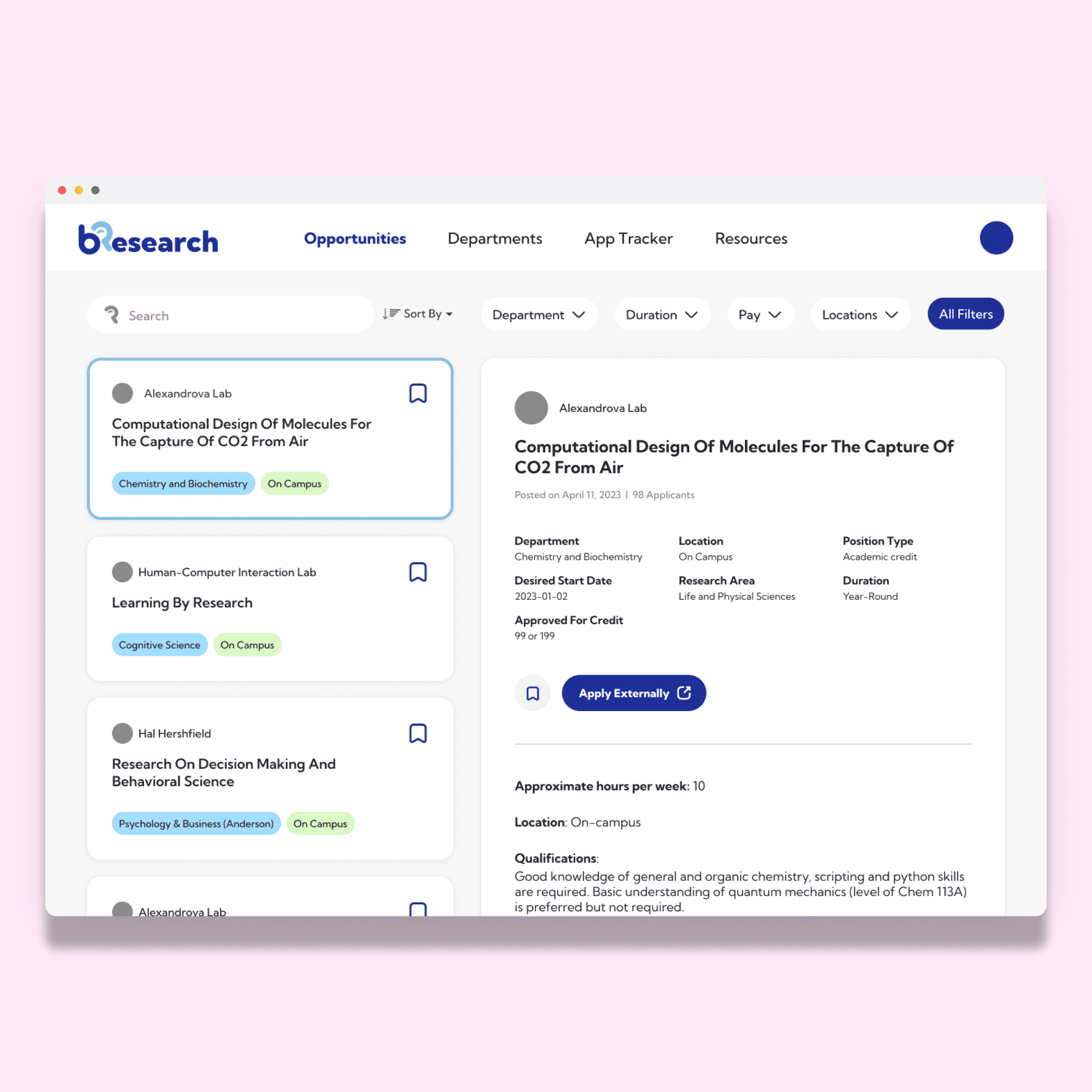
Solution
This is the Spring 2023 version of bResearch’s designs.
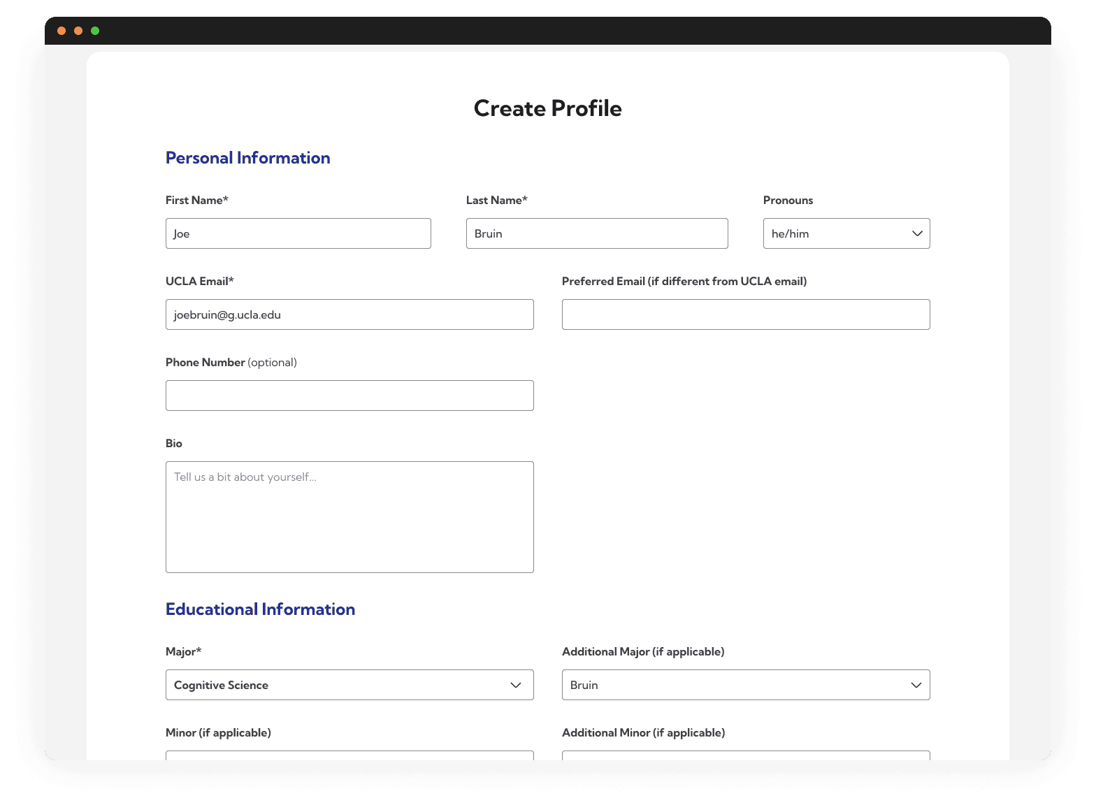
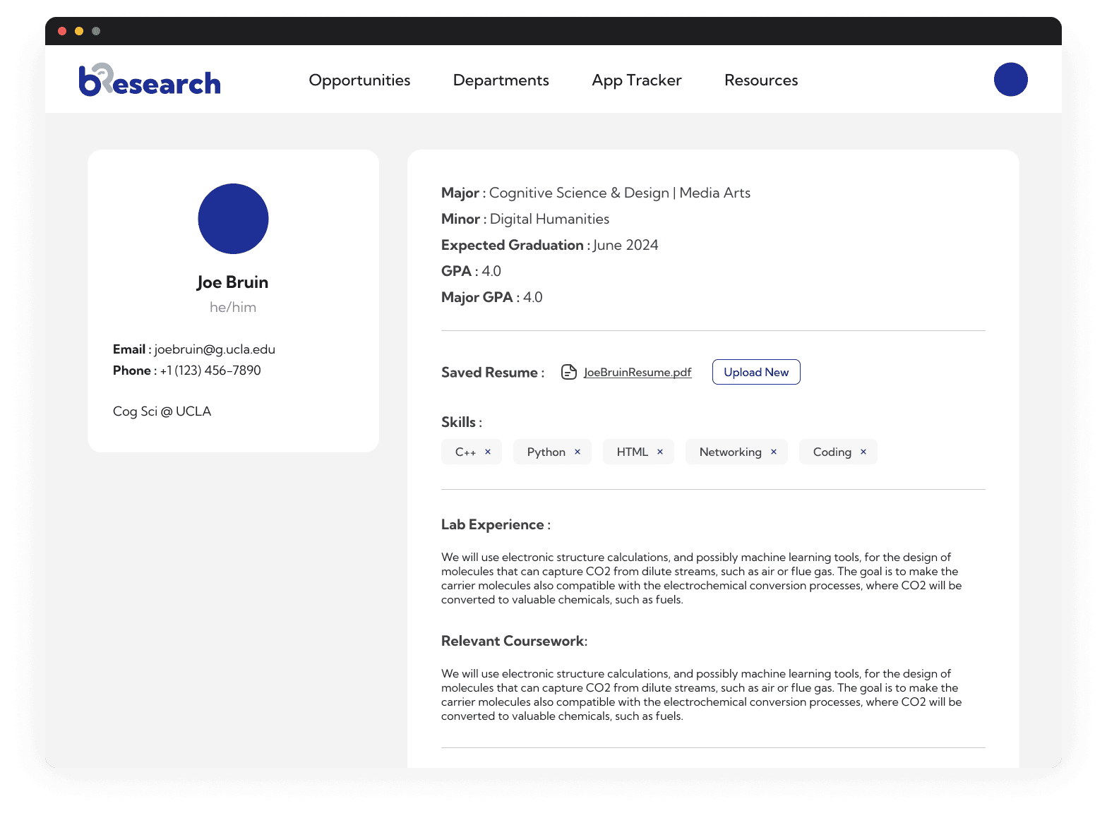
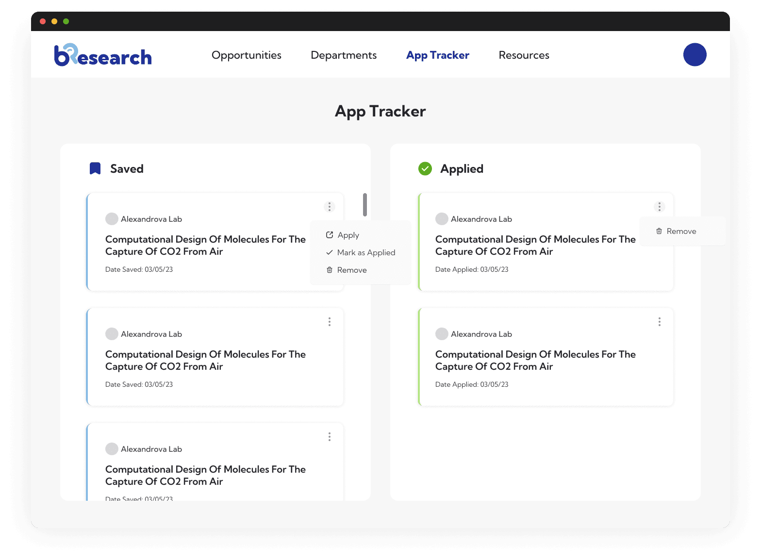
Student View
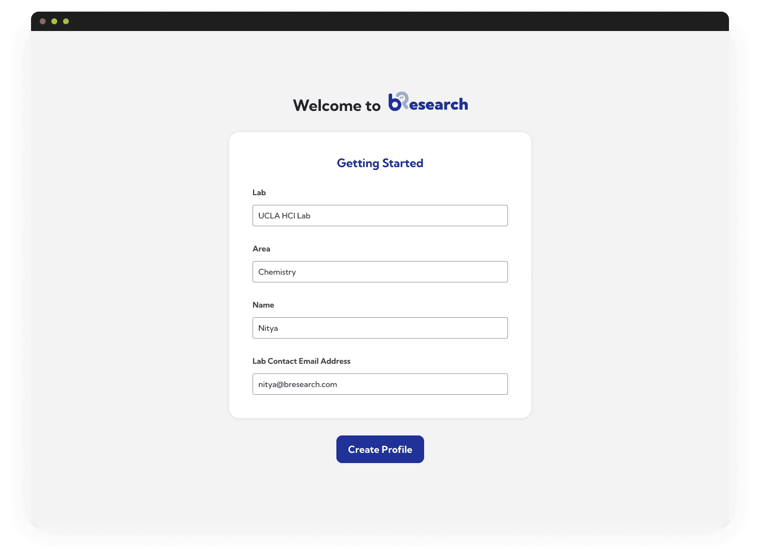
Students are onboarded, then they gain access to the main home page where one can find all the listings and an application tracker.

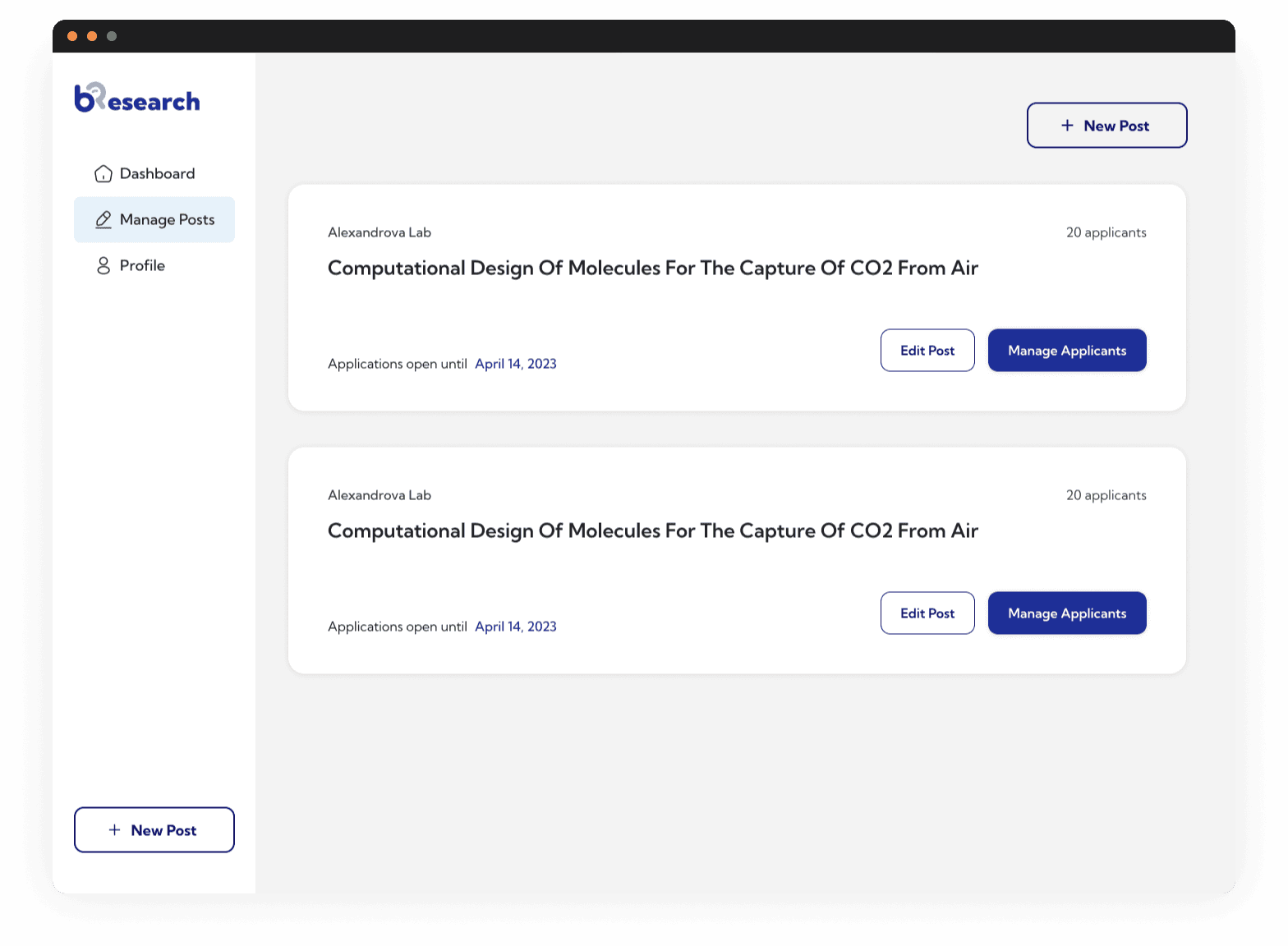
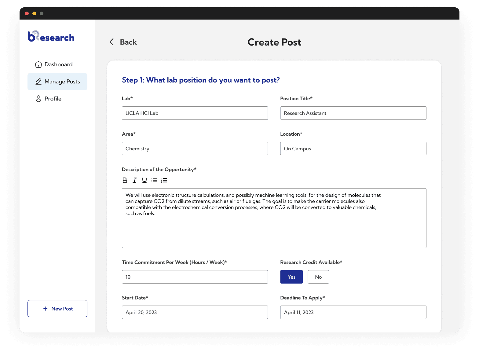
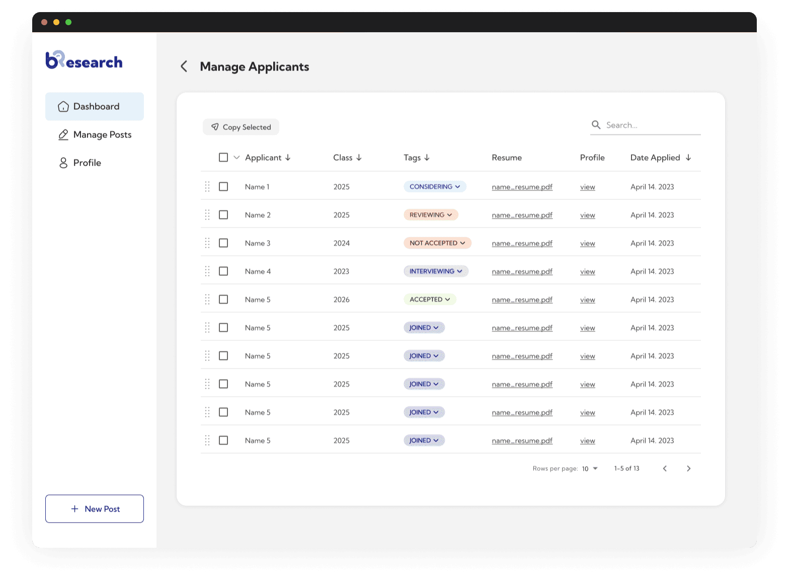
Researcher View
Researchers are onboarded (with a very simple form, to save them time), then they gain access to the main dash board where one can manage their postings and applicants.